Introduction
Our low-fidelity prototype was designed to represent the web portal interface we have been designing. In essence, our system is a web page that users can configure to consolidate information that they find useful. Our portal is specifically geared towards Olin students, so by default, one the user is logged in, it will show all email a student has received today, all calendar items for today, recent homework assignments, weather for Needham, and a search bar. All of our users use email, all of them need to know about homework assignments, an overhelming majority use calendaring software, and some are curious about the current weather, so the default page would probably be at least adequate for most of of the Olin student population. The students that need more customization options have the option to add RSS newsfeeds or bookmarks to the portal by using a simple interface that provides hand-holding for the novice user and shortcuts for the power user.
We presented our prototype to a subset of our users for usability testing. We had a set of ideas for the default layout of the site, how to add content to the site, and what kinds of affordances we were going to provide our users. The purpose of our usability tests were to determine whether or not our ideas were clear to our users, as well as determining whether or not the affordances we designed were clear to our users. In order to effectively test our prototype, we came up with some tasks for the users to perform that we felt were applicable tasks for our users. These tasks are detailed below. By choosing familiar, logical tasks, we felt we could iron out the bugs that affect most of our users.
Back to Top
Prototype
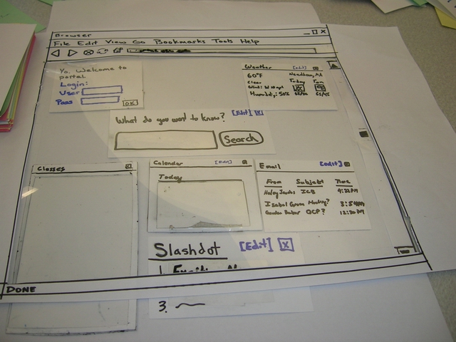
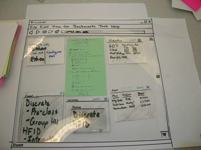
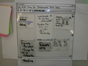
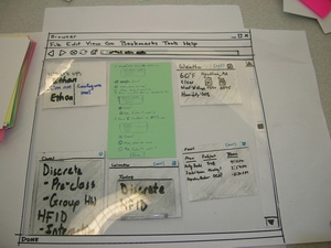
We constructed our paper prototype for our web portal out of paper, index cards, and transparencies. We cut a hole in a sheet of paper and drew a browser "window" around the hole. We taped a transparency into the window, thinking we would use it as a writing surface for dry-erase markers. In the end, it became a real hassle, because we had to remove the browser window overlay every time we want to make a change. We ended up just removing it after the first few uses in an interview, figuring our users were smart enough to suspend disbelief (after all, it's a paper prototype anyway). Most of the little boxes or "modules" are unpopulated at this point. Index cards seemed to be a good size for the box, so we just used those, adding transparency for a writing surface when necessary. The Slashdot module isn't necessarily part of the default page of the prototype, we've just included it the picture as an example. Several important things of note:
- Most of the boxes have a little "X" in the top right, which is an affordance for closing the box. We used the "X" because it's pretty much the de-facto standard in Windows, Linux, and Mac, the three most common operating systems.
- For the boxes that have editable options, we've included an "[Edit]" link, which is colored differently from all the other links to accentuate it as an affordance.
- The titlebar also serves an affordance for moving and reorganizing the boxes.
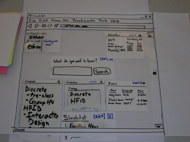
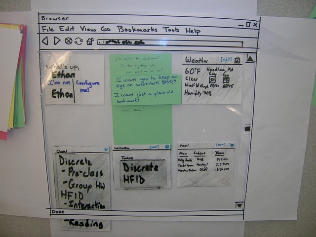
In the top left corner of the page is the login link for the page. For the purposes of the interview, we made up a username and password for our users, and had them "enter" the data. Once the user is logged in, the portal populates the classes, calendar, and email sections with user-specific data. The login box also changes to greet the user, while offering a "I'm not [user]!" link, just in case a laptop changes hands, or someone logged in on a lab computer, etc. It also offers a "Configure Me" link, which is an afforadance for adding content to the page.
Ideally, if someone clicks on an email or a calendar event, it will open the appropiate email or event in a new page, or in Outlook if the user is running Windows. As far as the classes are concerned, clicking on the class title will take the user to the class page, and clicking the homework assignment will take the user to the assignment's page.
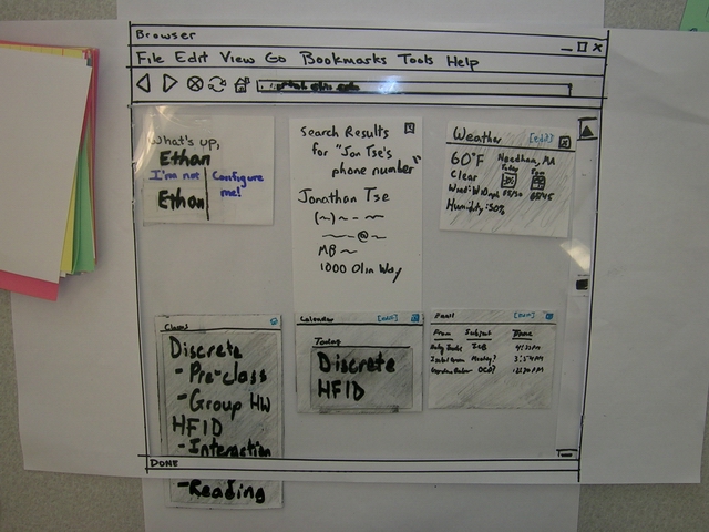
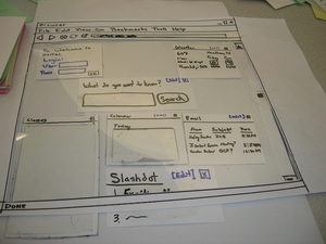
If the user wants to do a contact search, they can type their query into the search box, which will produce a search results box as seen below. The non-results boxes change color to a more muted color to highlight the search results box.
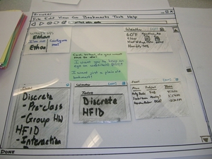
Editing the weather is as simple as clicking the "[Edit]" link. All the other boxes' colors become muted, so they attract less attention. The weather box displays all the current locations with a delete "X" so you can remove them. Adding a new location is as simple as typing a zip code or city name into the box.
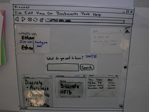
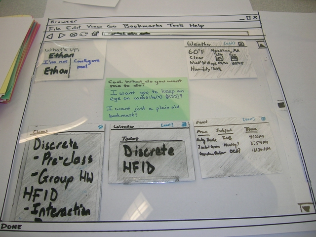
To add content, the user clicks the "Configure Me!" link, which takes them to a new page, where all the boxes are again muted in color to attract less attention. To further accentuate this, the new box with options is displayed in bright colors (represented with a green index card). Here, the user is asked to choose what kind of content they want to add, either an RSS feed or just a bookmark.
Assuming the user selects the RSS feed results in a prompt for a feed URL or a site to search for a feed.
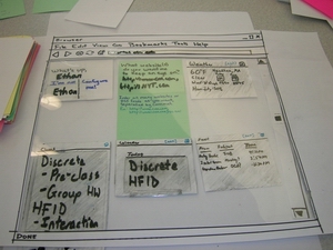
The portal then provides the user with a rendered list of RSS feeds and options for each of the feeds.
After choosing the appropiate options, the user is then presented with a confirmation screen which enumerates what changes have been made, and asks if they want to make more changes.

After that, the user is taken back to the regular page.
Back to Top
Method
For this phase, we went back to our users and had them interact with our prototype.
Participants
Our first interview was with a sophomore, aliased here as Paula. Paula claimed to be not technically savvy. Paula was familiar with the terminology, and even offered a few helpful ideas for the RSS aspects of our portal. Paula is a mechanical engineering major living in West Hall. Our next interview was with "Jorgen", also a sophomore majoring in mechanical engineering. Jorgen was technically confident, but did not know what RSS was. ("I don't really have time to read blogs, so I never learned what it meant.") Jorgen offered several insightful opinons on the portal, but was most focused on the calendar portion of the site ("Make it waay better than Outlook, please!"). Finally, we interviewed Felippe, a junior majoring in Systems. Felippe uses the google portal regularly, and doesn't like using RSS ("It's stupid, because for some blogs, you don't even go to the site anymore".) Felippe is technically confident and was eager to help us.
Task Scenarios
- Logging In - After giving the users a general overview of the portal, we presented the login screen to users and had them log in. For simplicity, we told them what their username and password were. What were we looking for?
- Adding an RSS Feed - Once users were logged into the default portal, we had them add a bookmark to a page that they wanted to keep track of changes on. This tested how easy it was to figure out how to add bookmarks to the portal, an important feature for customization.
- Looking up Classwork - By loading a student's SiS information upon logging into the portal, it knows the student's current classes and thus adds links and RSS feeds to class pages. Why did we have users look at this? Our user set definitely needs to keep track of homework assignements.
- Looking up Contact Information - We wanted users to find Jon Tse's phone number through the portal. There is no obvious cue on the page, so we wanted to see if users would be able to figure out that they needed to use the search function. Not having two separate search functions decreases visual clutter, but we wanted to verify that it was not necessary.
- Following up on a News Item - Assuming users had added a newsfeed to their portal, we wanted them to follow up on an interesting news item. We wanted to see if the way to do this was sufficiently obvious.
- Adding Weather in a New Town - The weather panel shows the weather in Needham by default, but we wanted users to add another town, as if they had gone home for example. We wanted to see if the way to edit a content panel was apparent and if the weather interface itself was logical.
Procedure
At our interviews, Jon, Doug, and Adam each had distinct roles to perform. Jon was the "Computer," and he created/edited content as necessary in response to users' actions. Adam acted as "Facilitator", and sat next to the users, describing tasks to and asking questions of the user. Doug was the "Observer" and recorded notes on what he did. We stuck with our roles throughout all three tests to get consistency across the tasks, at the potential expense of not trying different roles.
The interview started with Adam explaining the concept of a portal and the goals of the interview to the user while Jon set up the paper prototype. Adam then explained each task to the user one at a time, prompting and inquiring into motivations when necessary, with Jon and Doug performing their tasks and occasionally clarifying information or asking other questions.
Back to Top
Test Measures
While conducting user testing, we wanted to see how easily users would be able to find the way to do certain tasks. The purpose of a web portal is to consolidate information to make it more quickly accessible, so we wanted users to be able to find what they would be looking for as easily as possible. We also asked questions about what content users would use and how they would want it laid out. An intelligent default layout minimizes the customization necessary for users like Haley, and users like Gordon are willing to go through a few more steps to tailor it to their specific desires.
Back to Top
Results
The facilitator pointed out all of the features of the prototype and explained the basics. All three participants enjoyed and commented at some point on the overall construction of the prototype: "I don't think you needed this much detail." Having constructed an windowed overlay that gave the appearance of a "browser" was a nice touch, but ended up wasting time, as we'd lift up to change things, then put it back. Eventually, we decided to just have it for the first part, then move it away.
None of the three participants had trouble logging in to the portal. Comments were: "this is really easy.", "kinda like google", and "what's my password? is it my SIS or Milkyway or something else?" (The portal password for the demo was just the participant's first name, to avoid risk of exposing secret data.) We then moved on to the "adding new content" task. Felippe and Jorgen quickly clicked on "Configure Me", but Paula took a long time (and many hints) before she clicked it. "I'm not sure I understand what you want." she stated several times. The facilitator tried to use different words ("modify, change") while trying to avoid the word "configure". Eventually, Paula asked if the facilitator wanted her to click on "Configure Me." The facilitator responded that she should try clicking on it to see what happened. "Oh, I didn't want to do that. I might break the system." Afterwards, the facilitator asked Paula why she was hestitant to click: "It didn't seem like the right thing. And I didn't want to make a stupid mistake right away." Even though Felippe clicked "Configure Me" really quickly, he still helpfully pointed out "It's right next to the log out link. I was pretty sure I knew what you wanted me to click on, but it seems like that's not the right place to put it."
The add new content dialog box appeared on the screen for all three participants. Each was tasked with adding any website they wanted, prompted as "Think of a website you visit often. Find a way to make the portal keep track of changes." Both Jorgen and Paula immediately wanted to add Olin course websites, with claims similar to "I want to have it tell me if a new assignment is posted." Neither noticed that the default portal setup includes a box with information about classes. "Oh, I didn't see that." Jorgen said. Felippe made up a website on the spot: "I dunno. How about midgetswithwidgets.com?"
Paula and Jorgen chose websites that do not have RSS newsfeeds. They added bookmarks to the site, and the corresponding bookmark section of the portal appeared. To test the other interaction (a website containing RSS newsfeeds), the Computer decided that midgetswithwidgets.com had a newsfeed. No problems were encountered by any of the users.
At this point, Jorgen asked what RSS meant, since it had appeared on one of the prompts. After the facilitator explained, Jorgen asked if he could add some other websites, to which the facilitator agreed. "This is pretty cool!" Jorgen exclaimed, as the Computer quickly wrote up four new portal pieces and placed them on the prototype.
Next, each participant was asked to use the portal to find the Computer's personal cell phone number. Each quickly assumed they could use the single search bar on the page to find it, even though it wasn't explicitly labeled as a phone search. "It's the only place to search, so it's got to be there.", and "Hmm.. It says 'What are you searching for'. Can I just type in '[Computer]'s phone number?'. Felippe expressed mild hesistation. "I don't think his phone number is on the internet." When Felippe was reminded that this was an Olin only portal, he understood: "Oh, so it can search Olin things too? Cool." and typed in a search phrase.
We also explored how people navigate to other pages from clicking links in either the bookmarks or courses section. Paula said: "This is my homepage, so I'd just click the home button to get back." Felippe took a different path: "This is my homepage, but I'd much rather have things open in a new tab by default so I can close the tab or tab back to the portal." Jorgen was different still: "This probably wouldn't be my homepage. I'd use the back button."
Finally, we explored how each user would add weather information. Felippe claimed he wouldn't use the weather box at all. "I'd just get rid of it." as he threw it off the prototype page. Paula and Jorgen liked adding weather for home, Paula raised a good point: "This portal is great, but what if I want to get rid of Needham weather? It's depressing."
In between asking Jorgen and Felippe questions, we decided it would be important to learn about calendaring options. Felippe was the only person to get asked a specific question about the calendar. "I guess I'd like two days worth of stuff?". Jorgen was opinionated about the calendar: "Just have it show me big events. I know my class schedule by heart."
Back to Top
Discussion
- what you learned from the low-fi evaluation
- what you will change in your interface from these results
- what the evaluation could not tell you
Individual users have individual needs. We learned that people have a very specific way of laying out and using web tools such as portals, and these methods are incredibly diverse. We also learned that people have a tremendous amount of "built-in" knowledge about how portals should work. For example, each one of our users knew from experience with other portals that they could click on the namebar of each module to move it around the screen, a skill learned from Google. Additionally, participants were very comfortable with logging in, which is now so ubiquitous it was hardly worth testing.
One thing that immediately comes to our mind that we need to change is the visibility of the classes. Two of our three design participants tried to add links and feeds from websites that were by default displayed. We also need to investigate the calendaring options more, as our first participant didn't mention anything about it, and only after our second participant illuminated us to the "horrors of Outlook" did we begin to explore how we would create a calendar section. Additionally, we should change where we place the "Configure Me" link, as Paula and Felippe both expressed doubts and hesitation on clicking there. Paula's best quote to the team was "I didn't want to click there, I was afraid I'd mess something up."
The most obvious thing our evaulation couldn't tell us was what would happen if none of us were there to help the participants with hints. We also couldn't learn anything browser-specific like what actions people perform in Firefox versus IE.
Back to Top
Appendicies
We've compiled a list of materials and data from this phase below.
Test Script
Greetings, and thank you very much for helping out Team Betamax with a low-fidelity prototype test!
Throughout the course of the semester, we will be working on improving web portals so that they are designed with users in mind. During this test, we will be experimenting with some in initial design ideas. It’s important to remember that we are testing the system - we are not testing you! You may get “stuck” using our system. That's a good thing! We will make a note of it and improve it for the next version.
Here are the things we would like to see you try out:
- Logging into the system. For now, just “log in” using your first name.
- We’d like you to make some customizations to your portal. Pick a website you visit often and have the portal keep track of any changes that are made to it. You may know this by a different name, but if you don’t, don’t worry about it.
- Look up your classwork. Is there an assignment for your class?
- Follow up on a news item.
- Add new weather --we may not get to this.
- Calendar – Would you rather see the day as a whole, the next 5 events, the week, the month, or something else?
Back to Top
Teamwork Breakdown
| | | | | | | | | | | | | | | | | | | | | | Task | Task Weight | Adam | Doug | JJ | Jon | | Interaction Flows | 5% | 40% | 10% | 10% | 40% | | Task Scripts | 10% | 40% | 10% | 10% | 40% | | Paper Prototype | 15% | 35% | 20% | 10% | 35% | | Interview Prep | 2% | 80% | 10% | 0% | 10% | | Interviews | 40% | 33% | 33% | 0% | 34% | | Writeup: Intro | 3% | 0% | 0% | 0% | 100% | | Writeup: Prototype | 5% | 0% | 15% | 5% | 80% | | Writeup: Method | 5% | 50% | 50% | 0% | 0% | | Writeup: Test Measures | 3% | 0% | 100% | 0% | 0% | | Writeup: Results | 5% | 100% | 0% | 0% | 0% | | Writeup: Discussion | 5% | 75% | 0% | 0% | 25% | | Writeup: Appendicies | 1% | 0% | 0% | 100% | 0% | | Writeup: Assessment | 1% | 50% | 0% | 0% | 50% | | Total | 100% | 37.80% | 24.15% | 4.25% | 33.80% |
|
Back to Top
 Information Form